Custom paint-by-numbers for a holiday with friends
One box of acrylics, a stack of A3 paper and a poster for each guest. Notes from building my own paint-by-numbers kits, and what happened when people started painting.
- posters
- 11
- paint
- 50 jars, 42 used
- paper
- A3, 200 g
- painting
- 4 to 5 hours
- code
- ~3.7k lines
It started last year, on holiday with friends. One of them had brought a paint-by-numbers kit of famous cocktails: the drawings printed with their numbers, one small sheet per painting showing the finished result and its colours, and a pile of little numbered jars.
I hadn’t done this since I was a kid, and I am very bad at painting. It was a whole lot of fun, and surprisingly relaxing.
So for year two, the brief was one sentence: the same evening, but with posters made for the people around the table.
I didn’t want to upload photos to a website and wait for a parcel. I wanted to build it myself. I assumed the hard part would be the software, turning an image into numbered zones. That part was hard, in ways I’ll get to. But the two things that shaped the result most were elsewhere: what image you feed the machine, and what you tell people once the brushes are out.
Start with the paint
A shop kit numbers its own jars. Number 7 means whatever that kit decided it means. There is no standard, so the first decision was not about software at all: which paint would everyone share?
I bought a box of fifty acrylic jars online. The listing showed a chart of every colour with its name, and that chart was the reason I picked it. If I could turn it into a list, name and colour value for each jar, the program could work backwards from it: only use colours that exist in the box, and print the jar’s name next to each number.
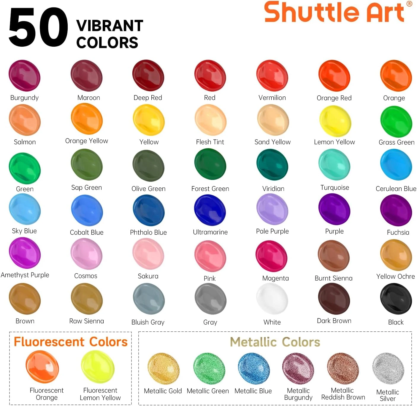
That became one small file, and the common kit for everybody:
{
  "name": "Shuttle Art, 50 acrylic colours",
  "colors": [
    { "name": "Burgundy", "hex": "#9B1747" },
    { "name": "Maroon", "hex": "#7E2A35" },
    { "name": "Deep Red", "hex": "#8E1418" },
    { "name": "Flesh Tint", "hex": "#F8CFA0" },
    { "name": "Sand Yellow", "hex": "#EDC592" }
  ]
}
The common kit
Forty-two jars made it into the list. I set the two fluorescent and six metallic ones aside, since there is no honest way to describe them as a screen colour. Then I went to a local shop for extra brushes.
One caveat I knew about from the start: those values were read off a marketing image. Each blob is a glossy render with a highlight and a shadow, so which pixel is “Sap Green” is a matter of opinion. They were estimates. That came back later, at the table.
A poster for each guest
Then the fun part: what should each person paint?
I started from personal references. A photo of their house, the place where they live, their pets. Then it widened into private jokes, the kind of poster that only makes sense to eight people. I wanted a mix, so that everyone could pick a favourite, and I made sure some were simple. Not everyone wants to commit to four hundred zones on holiday.
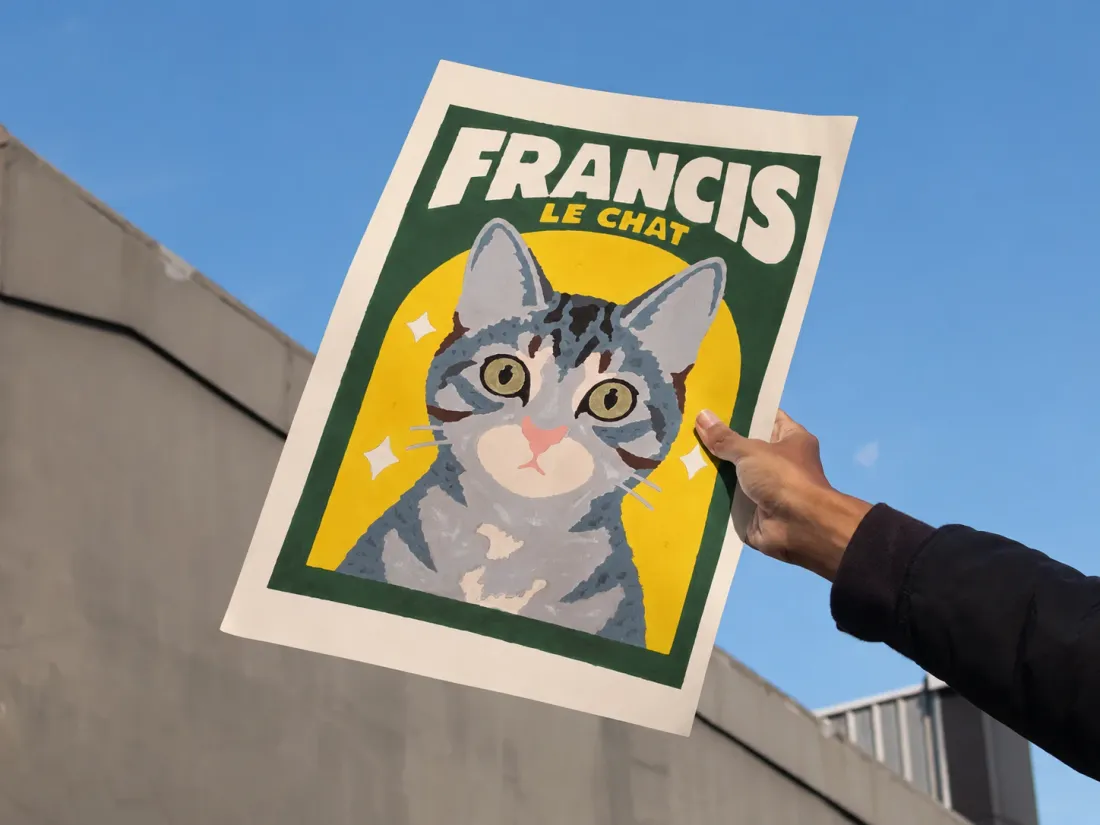
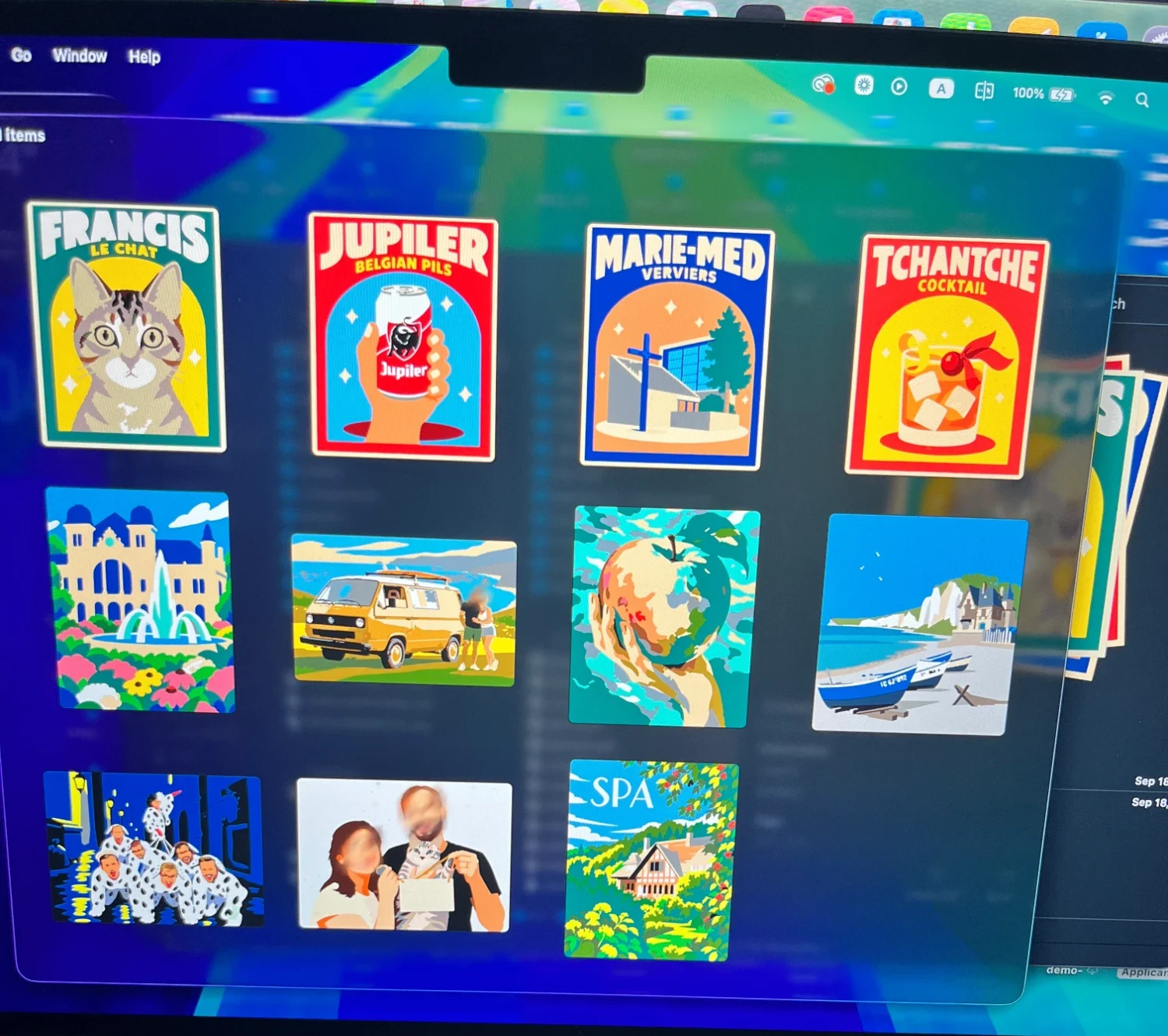
The final selection had eleven posters. A cat called Francis. A can of Belgian pils held up like a trophy. A cocktail, as a nod to last year’s kit. A house in Spa, a van by the sea, the beach at Yport, and a few that I won’t try to explain.
Photos don’t want to be paintings
My first attempts started straight from a photo, with an algorithm to simplify it. It worked, technically. It never had that acrylic feel. A photo is full of gradients and noise, and reducing it to fifteen colours gives you a posterised photo, not a painting.
What I actually wanted was the style of those flat travel posters: few colours, clean shapes, every area an obvious brushstroke. So I added a step before my own tool. Generate a simplified illustration first, then cut that into zones.
I worked on a prompt that asked for flat areas, a poster style and as many distinct colours as possible. Results were mixed, and it became a test-and-learn process:
- For scenery and imaginative posters, ChatGPT’s image model gave me the best output.
- For faces, Gemini was better. Its simplified people looked more like the actual people.
- Sometimes both. I’d take an output from one and pass it through the other to simplify it further.
The first pass was often too rich. The Yport poster is a good example. It started from a photo of the beach found on Wikipedia. The first illustration kept everything, including a beach of several thousand pebbles, each one a zone nobody would ever paint. The second pass turned the beach into a single flat area, and the poster became possible.
The boat in the foreground kept its registration number all the way to the poster.
The spec did most of the work
Before any code, I wrote a short requirements file. The idea in plain language: a photo goes in, a printable kit comes out. A poster with thin outlines and numbers, a palette sheet, a colour preview to check before printing.
The steps were all in there:
- Reduce the image to a handful of colours, either freely or restricted to the jars I own.
- Merge the zones that are too small to paint into their closest neighbour.
- Trace the outlines as smooth curves, shared between neighbouring zones.
- Place a number in each zone, where there is the most room, and several in large zones.
- Export for the chosen paper size.
I built it with Claude Code, engine first, then a small local interface with sliders and a live preview. The engine is a plain library with a command line on top, and the interface is only a layer over it:
pbn photos/spa-detaillee.png --paper A3 --palette palettes/shuttle-art-50.json --colors 14 --min-area 0.04 --min-width 1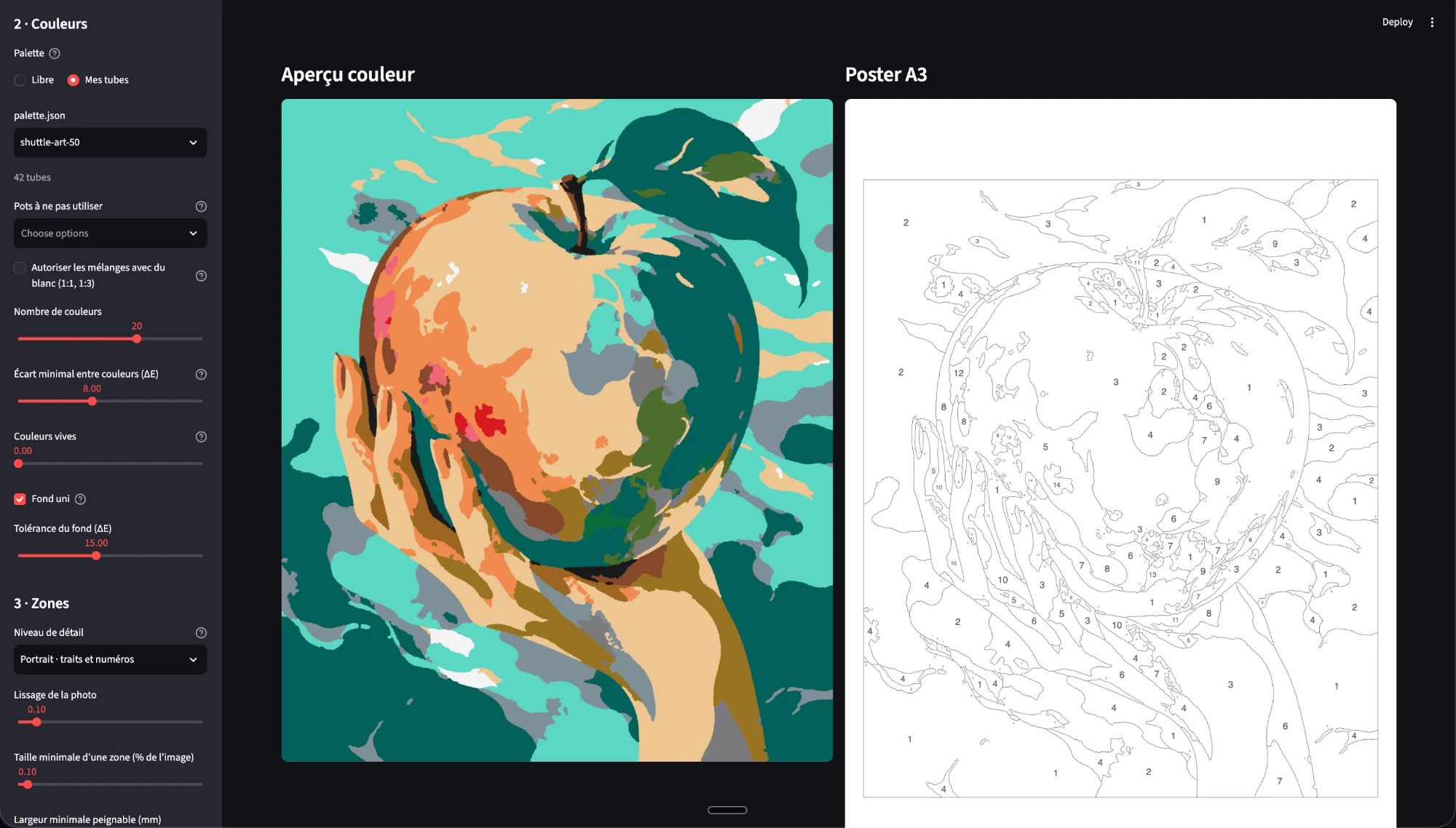
The spec was wrong in useful ways. It said no zone should be smaller than 0.4 % of the sheet. On a real poster that erased everything that made the image recognisable: lettering, berries, the timber framing of a house. The setting I ended up using was ten times smaller. It also asked for a preview in under three seconds. I stopped caring about that almost immediately. I can wait for a better poster.
Here is the house in Spa going through it. Look at the roof.
What the machine had to learn
Once the first poster came out, the rest of the work was a list of small discoveries, each one made by looking at a poster and thinking “nobody can paint that”.
A number needs room. A zone can be big enough to paint and still too narrow to hold its number. For those, the number sits outside and a dotted line points into the zone. It works up to a point. One of my detailed posters ended up with several hundred of them, which is a sign that the image is too complex, not that the labelling is clever.
An eye is not a speck. To the cleanup step, a pupil is a small dark stain like any other, and it gets merged into the face. A portrait without pupils is not a portrait. Small zones that contrast strongly with their surroundings are now kept, and I can paint a rough mask over an image to say “more detail here, less there”.
White is already there. The paper is white. Asking people to paint white on white, around a number, is silly. I added an option later on: white zones keep their outline but get no number and no paint. On one portrait that removed thirteen numbers, and nobody missed them.
Thin text can’t be painted. “SPA” survives, because each letter is wide enough for a brush. “Home sweet home” underneath has strokes under a millimetre wide, and it simply disappears. When a poster needs a caption, it is printed in black under the image instead of being cut into zones. The registration number on the Yport boat was worse. I tried erasing it click by click, and each click left a halo that came back as new tiny zones. Twenty clicks later I still had stains. Painting a mask over the hull removed it in one stroke.
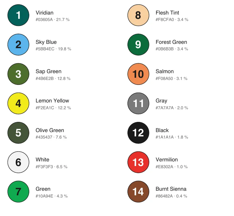
More colours don’t help if the box doesn’t have them. The box is made of vivid colours. A slate roof or a pale green has no close neighbour in it, so the nearest jar is salmon, or lemon yellow. On a pastel image, cream sky and pale green sea, going from 20 to 26 colours changed nothing: the box holds no softer jar to pick. Only mixing gets you closer, and the palette sheet can suggest those mixes, a jar plus white, to adjust by eye.
Build the escape hatch, then don’t use it. For details too fiddly to paint, I built a mode that pre-prints them in colour, so that the eyes are already there when you start. I never used it. In the end I printed black outlines only. A sheet with nothing but lines and numbers is what makes it feel like a kit, and people are better with a small brush than I expected.
Printing day
Once I had my results, I did a final curation and generated three things:
- one collated PDF with every poster, ready for printing;
- a colour version of each poster, with and without the numbers on top, as the reference;
- a palette sheet per poster, with each number and its colour.
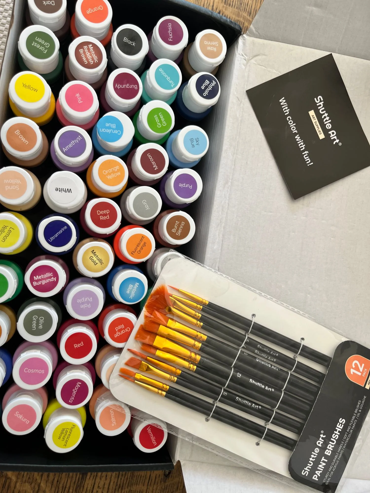
For the paper, I went to my local stationery shop and bought a stack of A3 Canson, 200 g. Solid enough to take acrylic without buckling. I knew the same shop lets you bring your own paper to their photocopier. So I bought the stack, handed it back across the counter, and had the posters printed on it.
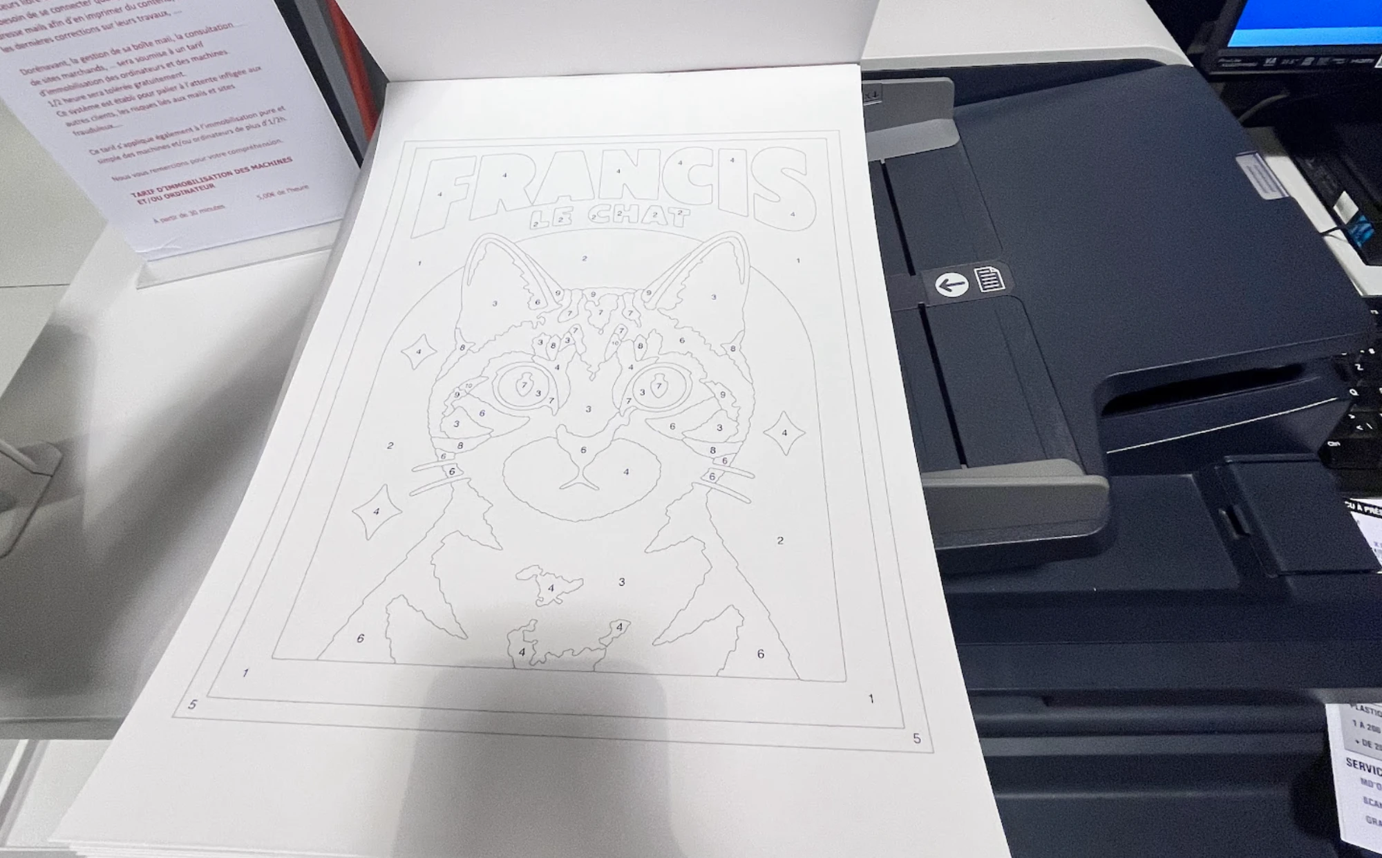
Then everything went into one box: the printed sheets, the reference material, the paint, the brushes. I also packed a few black markers in different widths and one white paint pen. They turned out to be useful for the smallest details and for tidying an edge.
And then we painted
It took four to five hours per poster, spread over several days. To be honest, we still need one last evening after the holiday to finish them all.
Some paint doesn’t cover. A few jars were too translucent, yellow above all, and the printed number showed through. Those needed a second coat. Next time the numbers could be printed in grey rather than black, or the weakest jars kept away from the large areas.
A lesson from the table
The template is a guide, not a contract
The thing I had not planned for had nothing to do with software.
People followed the numbers exactly, because that is what the sheet tells you to do. And then they got frustrated. My cat looks brownish, he’s greyer than that. My roof isn’t that colour. They were right. The colours came from a box of fifty jars and from my estimates of what was in each one. The closest jar is sometimes not very close.
What surprised me is that nobody fixed it on their own. They had been given instructions, and they wanted to respect them. So I had to do a bit of education: pick another jar. Mix two. Add some white. Ignore a number. It’s your cat.
Once that door was open, everybody was happier, and they painted more than before. The posters that took liberties are the ones people are proudest of.
Francis is the proof. The sheet asked for beige and brown. My friend looked at it, thought of the actual cat, and painted him grey, with a pink nose and green in the eyes. None of that was in the instructions. It is closer to the real Francis than anything my tool produced.
All my effort had gone into making the tool more faithful to the image. The better fix was one sentence, said out loud at the table, and it belongs on the palette sheet next time.
What I’d change
Measure the box properly. Paint a swatch of every jar on the same white paper, photograph it in daylight, and read the colours from that. Every poster depends on those values, and mine were guesses.
Show the difficulty before printing. Number of zones, the smallest one in millimetres, how many numbers sit outside their zone. I chose “simple” and “detailed” posters by eye. The tool could say it.
Fix a zone by hand. Merge two zones with a click, protect a pupil, move a number. A handful of corrections decide whether a face looks like someone, and no threshold will find them.
Say it on the sheet. “These colours are suggestions.” It costs one line.
People have already asked what we paint next year. The tool is ready. Choosing the images is still the part that takes the time, and it’s the part I’d keep for myself anyway.